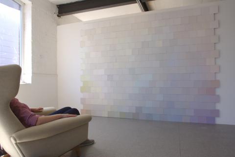
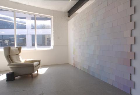
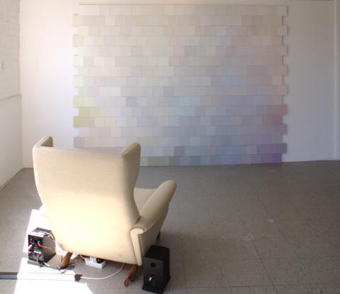
A bewildering array of whites confronts the viewer in this work, accompanied by a soundtrack of paint names endlessly repeated. The work makes reference to the designer paint colour chart and playfully explores the meaning and value of names, the importance of context for meaning, and the manipulation of consumers.
The designer paint colour chart is an attractive, tactile object, with real paint samples matched with poetic, resonant names. How does one choose a colour? Is it a purely aesthetic choice, comparing one colour to another, or do the names affect our choices? The names are not merely descriptive but give colours their own character and identity. The names appeal to our desire to improve our social status, such as 'Knightsbridge fog' rather than 'Gorbals mist'. But why should we accept these values, is it even possible to reject them?
There is an obsession with white in interior design; a disproportionate number of colours on paint cards are a version of white. Fear of colour or fear of making a wrong colour choice leads us to choose the 'safety' of white. However, few if any of the colours called 'white' on a paint card are a 'pure' white. Tints, tones, and shades are marketed as white, which brings us back to the dilemma of how to choose and the influencing strategies of paint companies.
Emulsion paint, plywood, wood, sound, armchair
307.5 x 232 x 2cm


